

Bachelor of Arts - thesis in cooperation with Volkswagen Commercial Vehicles, 2020
No Worries
the conception of a service design process to identify user needs followed by the creation of a prototype using the example of the I.D. Buzz
OVERVIEW
This bachelor thesis was created in cooperation with Volkswagen Commercial Vehicles and consists of two parts working hand in hand to display the holistic service design process. Whereas the first part focuses on user and vehicle research in the commercial environment as well as synthesizes insights, the second part follows up on validating those insights with users, centering around the need for maximum reliability and digital communication as painpoint. The created solution is a progressive web-app concept, which is accessible as in-car feature and supports companies in the business of people transportation. In the beginning, the biggest challenge was the uncertainty of what it was going to turn out to be.

CORE QUESTIONS
How can the I.D. Buzz create additional value and support businesses as well as users in their daily life by solving problems and creating a positive, meaningful User Experience?
What needs and painpoints in the commercial environment exist? How can the I.D. Buzz satisfy needs, given the three identified attributes that make the vehicle special? Considering this being a one-person-project, how does User Research, UX and UI work hand in hand?
USER
Anybody within the commercial sector could have been the user. Due to insights gained during the process it turned out to be the drier of people-transportation companies. These individuals actively use their vehicle everyday and carry out assignments that are in direct contact with the client. Supporting them in their daily tasks can make their job easier, more fun and productive, give them more time to engage with the clients and therefore improve the overall experience for them as well as for the clients. - more details on that later on. :)
ROLES & SCOPE
This project was a single-person effort with occasional help from the mentors Katharina Felski (Head of UX at Customer Focus & Design, VWCV) and Stefan Wölwer (Interaction Design, HAWK Hildesheim). 8 weeks were used to conduct research and cover groundwork. An additional 8 weeks were the scope of the bachelor thesis, in which I created a concept for a possible solution.
ADDITIONAL NOTES
This project, its results and opinions do not necessarily reflect the Volkswagen AG. All the information presented in this Case Study are based on official sources.
Before we get into too much detail... a sneak-peak of the result:
A progressive web-app as in-car solution for businesses in the field of people transportation.

PROCESS
Looking at Don Norman’s HCD process, the double diamond model and the design-thinking process I used the following framework as overall structure for the project, because it emphasizes on the importance of understanding the underlaying problem first and then creating a possible solution.
1. Understanding - desk research on the vehicle, its special properties and potential commercial use cases as well as research based on first-hand user research
2. Empathy - conducting shadowing and interviews, asking questions, creating empathy maps, documenting jobs-to-be-done
3. Synthesis - Employee Journey mapping, finding painpoints & needs, generating value network map, validation of insights with the passenger transport company
4. Idea generation - using design sprint methodologies to generate ideas, scribbels and wireframes to design a first draft of the possible service
5. Prototyping - Definition of specifications and premises, generating several flow diagrams that illustrate how the service works, implementing a tag-logic, creating an information architecture, defining use-cases and write their user-stories, creating a storyboard for testing
6. Testing - based on storyboard: creation of medium and high fidelity wireframes in Sketch. Using InVision to create a click-dummie, testing followed by iteration of pain points
1. Understanding
First I wanted to find out what kind of vehicle the I.D. Buzz is. Talking to colleagues, reading documents, doing desk research and visiting VWCV Oldtimer to hear stories about their history I eventually identified three attributes, that make the vehicle, which is not on the market yet, special. During this time I also approached companies and planned user research as executed in 2. Empathy.

Picture I.D. Buzz & T1 https://www.caricos.com/cars/v/vw/2017_volkswagen_id_buzz_concept/images/20.html (28.01.2020)
Attribute 1 - Electromobility
Based on VW’s concept MEB (engl. the modular electric drive matrix) the I.D. Buzz will be able to drive a minimum of ca. 300 km per charge. The infrastructure for e-cars in europe is not yet sufficient and still improving.
Attribute 2 - Connected Car
A built-in internet connection guarantees the I.D. Buzz to reliably send and receive data and enables the usage of progressive web-apps, which can be easily updated and have the potential of further improving in-car usability and user experience.
Attribute 3 - Roots
Following the widely beloved model T1, the I.D. Buzz reuses some key design-elements such as the overall rounded look and therefore calls upon emotions intentionally. Throughout the generations the use cases of these light-duty vehicles were mainly to support craftmanship and transport people.


2. Empathy
What did I do?
Two iterations of research helped me understand needs, pains and motivations in the commercial sector. Firstly, exploratory reserach opened up the research angle to understand relations and context. For this I attended an event about e-mobility, to get in contact with the current mindest of individuals. After all, the people that would buy the I.D. Buzz are also human and their concerns would probably not differ too much from what private people worry about - electromobility is very young and there is almost no experience yet. I also talked to a dealer of light-duty vehicles about his concerns, his clients wishes and needs and the current state of digital products made by the automotive sector. Last but not least I talked to colleagues and did research about current political views about e-mobility. The second research iteration labeled as descriptive research focused on two companies that were more or less in the business of people transportation. I conducted interviews and had the chance to shadow an employee to gain first-hand insights. To provide some context: I do not mean taxis, but transportation of people that have disabilities or limitations. Those clients would rarely call spontaneously to get picked up, but rather have a known schedule that the companies disposition can work with and offer transportation on a regular basis and if possible with the same driver, so that clients can get used to them.
How did I prepare?
I created a customized mind-map set up as questionnaire for each stakeholder and interview partner to enable me to spontaneously adjust to the conversation.


Key Insights
- Customization, individual form of mobility and using the vehicle sustainably must be possible
- Electric vehicles are too expensive and digital services do not solve problems and therefore aren’t satisfying yet
- Commercial environment does not know the benefits and potential a connected car can have
- Trust between the OEM’s and Stakeholder is shaken and not transparent enough
- The enthusiasm of people hasn’t been triggered yet
- Fleet consists of different models and brands
- Reliability has top priority. They have driver coming in to work instantly in case somebody calls in sick
- Driver had an analog list of client addresses assigned to one destination (f.e. day-care), displaying one week in total
- Changes were communicated via telephone; the driver would stop the car, if necessary next to the road, to call back
- Driver logged the route of each tour into an analog book before starting it
- Driver needs to be able to drive a minimum of 200 km a day
- Driver takes the vehicle home but doesn’t use it for personal errands
Deliverables
To organize thoughts and create communication material I created a Value Network Map, an Employee Journey Map, 30 Jobs-to-be-done and 9 problem statements that described situations I had observed. Those could later be checked if true or not-yet-true (because a statement can never be false, but rather more-unlikely-to-be-true. I had this discussion with a colleague of mine and found it very interesting).
3. Synthesis
Having gained many insights, I planned and conducted a design-thinking workshop with a multidisciplinary team of colleagues to identify needs and painpoints. We underlined the observation of the importance of reliability and that many analog processes potentially harm this need as well as create a high potential of misunderstandings. To work truly user-centered we agreed to me going back to the company to validate insights and identify the final problem statement.
If I wouldn’t have gone to the company a second time, I would have solved OUR problem, not necessarily theirs.

Additional insights during validation
- The company is not allowed to track GPS-data from their driver
- 70% of the employees is not affin with digital products and devices
- Transfer of data needs to be compliant with german law (DSGVO), because of sensitive data. That’s why they cannot use WhatsApp
- Focus on digital communication as enabler for future possible features
- Not every driver has the ability to write
Focus
Digital communication is partly used, mixed with analog processes and currently not very effective. Improvements would benefit the need for reliability and also act as enabler for possible features in the future.
(Digital) communication - who, how, why?
I continued by analyzing the current state of communication and looked at 5 stakeholder: Disposition (plans and organises assignments), driver, clients, clients relatives, destination of assignment (e. g. school, day-care). This resulted in identifying 16 use cases such as communicating spontaneous changes in a tour (disposition to driver).


Orientation - Design Sprint à la Jake Knapp
The Design Sprint methodology helped me to find a red thread. First, I defined the long-term goal. After all the research insights I wanted to focus on the driver - he is the one providing the service and if he is happy it is more likely that the clients enjoy their transfer. Plus I wanted to find a way to make their jobs easier - they already have to focus on clients and traffic. Any additional tasks could maybe be automated, so that they wouldn’t have to worry about them. In addition, it is not easy for those companies to find good employees. If I create a more positive work experience for the driver, maybe more people would like to be a part of this, which would benefit everybody. :)
The goal is to digitally support the driver, so that he can fully concentrate on the optimal execution of his assignments.
I then continued to write down „How might we…“ questions, thought about assumptions and created a draft plan which illustrated on where to focus: The activity of driving. Spontaneous changes in the tour would be communicated over phone and disrupt the entire routine of the driver. Apart from that the assignments are communicated weekly over a sheet of paper. If this would be digitalized, the driver would get instant updates, which would result in less calls. Also the driver wouldn’t have to drive to the office to pic up his assignments for the week. Online navigation could be included and would help the driver finding addresses - this has been a painpoint so far as well.
The digital documentation of tours would enable the driver to concentrate on his assignments and decrease chances of distraction.


Focus on Use Cases
- Service needs to support the driver and not give him extra work to do
- Usability needs to be intuitive and quickly adjustable, because driver are not necessarily affin with digital products. Obstacles to use the service need to be as low as possible
- Flexiblity is necessary so that the service does not irritate the driver but rather adjusts to his habits. Also the car should be able to send data directly to the software the disposition is using so that there is not an additional effort created
- Feedback at the right time to communicate what the service is doing and what data is being sent to whom
- Privacy: no GPS-Data can be collected and data transfer needs to be safe (DSGVO)
Challenges
- Documentation of tour
- spontaneous changes in a tour (notification concept)
- display best route to address via online navigation
Progressive Web-App as touchpoint - but why?
Driver do not necessarily own a smartphone and a PWA doesn’t depend on it. Also it can quickly be updated and installed from the far - no additional tasks for the driver included. Improvements in concept, flows and usability can easily be deployed so that the driver has the best UX possible. This touchpoint uses one special attribute the I.D. Buzz offers: Connectivity. In addition there no known use cases where the driver needs a communication device outside the car.

4. Idea generation
Software and Design Decisions
- I am using the VWCV fontset and icons
- Data can temporarily be saved locally on the I.D. Buzz

3 ideation cycles
Each ideation cycle focused on its specific topic, starting with the overall concept, following up with visual design and lastly service design.
As methodology I was inspired by the design sprint. For the first two phases of ideation I stuck to research on existing services & products that offer a great service, user experience and implement elements that generally convinced me in relation to usability and interaction flows. I researched each product in detail and followed up on leads to other products that arose. The goal was to create scribbles, that remind of the initial idea. I made a sketch for each element, gave it a title and wrote down the source.
Ideation 1 - Concept
Whilst doing the research I enjoyed the navigation of the Spotify app in „your library“: The secondary navigation elements (apart from the primary bottom navigation) were „only“ words in a bold font. Deactivated they would be grey, activated white and underlined in the primary accent color, which in this case is green. The combination of this navigation choice with a dark theme made the information easily accessible to me, as the user.
Another service I particularly liked was the Google Calendar, which includes great storytelling as wordings, icons and illustrations work together very well and guide the user through the experience.
I also looked at the interaction flows and structure of the infotainment system of the I.D. 3, which would be close to the ones the I.D. Buzz would get (side navigation, home button behavior, widget placement and size,…). I also found out that if the drive has connected his phone to his car and is being called, that a LED stripe in the windshield lights up as indicator.
This step of looking into the I.D. 3 was VERY important, because this way I was able to create a service that would blend in the overall navigation concept of the car.


Ideation 2 - Visual Design
The research I did for this specific topic focused on infotainment systems as I analyzed what visual elements were being used and worked well in an in-car environment in regards to usability. The I.D. 3 uses one color for accents, that highlight for example whether something is on/off. I created a moodboard for later orientation, so that the insights can create additional value to the user & interaction flows created in the step before.
Ideation 3 - Service Design
This phase focused on the three use cases explained above (3. Synthesis). I broke them down into the four user flows:
- Documentation of a tour - general navigation through web app
- Documentation of a tour - start to end flow as driver progresses
- Notification concept - changes made to the current destination
- Notification concept - changes made to a destination within the active tour
I used the following methodology to sketch first ideas of a possible solution:
- I took notes while looking at every insight I have gained so far.
- Sketched rough solutions - they didn’t have to be pretty, just visualize a thought. At the end of this phase, I marked the scribbles I viewed as best.
- This is called the Crazy Eights. I folded a paper, so that I had eight rectangles on each side. I then thought of alternative solutions to my previous ones - I had one minute to fill each rectangle. The tempo makes you worry less about whether an idea is good or bad, whereas the eight rectangles make you think outside the box - you need to fill them all. ;)
- Sketched one solution as a three-part storyboard. It is important to think about correct wording and that the sketch is able to explain itself. Also: I gave it a title that attracts attention.
For each flow I created a „final“ sketch and made adjustments, as my thought process progressed. I also created an information structure behind these interaction concepts.

First-solution-Features
- Possible Views: Weekly overview(current week + 3 weeks into the future), daily overview, detail view of tour
- Each tour gets a tag: Upcoming; In Progress; Completed
- Driver can edit order of clients via drag & drop, new order will be saved as default
- When the driver gets to the home of a client and picks him up, a question will be displayed in the widget: „Have you successfully picked up Mr. XY?“ - „Yes/No“-next destination will be displayed
- If the current destination gets deleted by the disposition, the driver will be redirected automatically and drives to the next client
- If a destination within the active tour is being edited by the disposition, an indicator within the widget will be displayed
Goals
- Automatisation of the service as far as possible, to ensure that the driver does not get additional tasks (When driver couldn’t pick up client, the disposition gets this information as soon as the tour is ended & is able to react)
- Display of information without overwhelming the user - timing is everything
- Create an overall consistent experience regarding to web-app and car itself
- Working with the Widget as good as possible, so that the driver has to open the PWA rarely


Challenges
1. Displaying the names of clients as Header in Widget.
This was something I initially wanted to do, so that the personal connection between driver and client gets strengthened. But how does it get displayed, when the driver picks up multiple clients at a destination? Is it going to end up being „Mr. Hudson, Mrs. Gar…, +2“? No - the information is too important to just display dots. I therefore decided to put the address first and clients as list elements second. This way, they will always be visible and clearly communicated to the driver.
2. Knowing if a client has been picked up can be relevant information for the disposition. They can cross him off the return tour for that day, after double checking with the client. Also they have the information straight away and implement it in payment matters, in case it’s relevant for them. But how does the system know when to ask the driver, if he has picked up client XY successfully?
Research showed that before the driver picks up a client, he slows down the car until it stands still, turns it off and locks it, he always takes the key with him. This behavior can be discovered digitally and in combination with GPS-data, which shows that he is in a certain radius from a destination of his tour, trigger the question.
3. How do I make sure, that everything is DSGVO-compliant and that the disposition gets no GPS-data of the driver?
As soon as the driver starts a tour, the I.D. Buzz stops sending any data to the disposition. At the same time, the vehicle can receive any updates that might be entered for the active tour. Once the tour is finished by the driver, he gets the notification that data has been sent to the disposition. This data does not involve any GPS data though. By receiving the order of the clients though, the disposition can create a logbook entry automatically, so that the driver does not have to worry about this anymore.

Iteration
To implement the insights that occurred by identifying the challenges, I pinned my sketches on a whiteboard and slowly replaced them with sketches underneath. I continued to do this until I had a logical first draft that I could build on in the following prototyping part.
„Service Design should not end with a concept or a prototype. The aim must be to have an impact on people, organizations, and the bottom line.“
This is Service Design Doing, p. 268
5. Prototyping
Goal: create a user-centered solution for those three use cases within one application
Draft idea from ideation phase: The driver opens up the upcoming tour, is able to change the order of the clients that he wants to pick them up in (which will then be saved as the new default value), starts the tour and then follow the navigation of the I.D. Buzz.
Requirements: No transmitting of GPS-data to the disposition. Secure data transfer, which is DSGVO compliant.

Setting boundaries
I made sure that the requirements were met by identifying the stakeholder involved and define the data flow. GPS-data is only sent to the VW backend for navigational purpose, whereas sensitive data is only accessible within the PWA and sent to the disposition, no GPS-data attached.


Timing of data transfer
The I.D. Buzz would always sync with changes made from the disposition and adjust the tour automatically. While the vehicle is receiving data from the disposition and the VW Backend for online navigation purposes, it does not sent any itself when it is in an active tour. When the active tour becomes inactive because it has been finished, the vehicles sends this data to the disposition, while giving feedback about this to the driver.
Tags
Each stop would be given an address and at least one client, defining whether the driver has to pick him up or drop him off. If he gets picked up, the driver needs to state whether this action was effective or not (if the client is sick and didn’t call the disposition, the action would be ineffective). This mechanism saves whether everybody was transferred and if not, who was missing. This way changes in the connected route (if somebody gets dropped off at day-care for example, he needs to be picked up later in the evening and brought home) can be make automatically. The table below explains which attributes can be edited when a tour is upcoming | in process | finished.

Information Architecture
Differing between the PWA and its Widget, I organized the elements needed for the functions to work in order to create an intuitive navigational experience. The Widget would adjust to the state of the PWA.

Epic „Documentation of a tour“ - User Stories, Preconditions
I continued by writing down the three Use Cases and worked out their details by finalizing the User Stories and preconditions - 25 in total. This step really helped me to think of details that would ensure an improvement in usability and communication of feedback.
Example - Use Case Documentation of a tour - general navigation through web-app
Overview of work schedule
As driver, I want to have the work schedule for the next days and weeks, so that I can plan ahead.
Preconditions:
- The vehicle stands still
- The PWA is opened
Flow Chart
This step concentrated of the visualization of user and interaction flows as well as helped me to double-check the logic I implied.

Employee Journey Map 2.0
What would change if the driver were to use the service? What would the daily routine look like? Which Pain Point would be erased? Are there other issues that might arise?
Benefits
- The driver knows his schedule 4 weeks in advance (compared to one week)
- No need to keep an analog logbook
- Less calls during work time, therefore less distraction and increased safetiness of employee and clients
- The driver does not have to drive to the disposition once a week to pick up the schedule
- Online navigation is more efficient and reliable, traffic jams can be avoided, transfer will be punctual
- Order of clients will be saved as default when changed - an extra customization for the driver
New Routine
- Start of each tour needs to be done manually
- Driver has to interact with widget at each client-pick up
- At the end of each tour the driver can edit data and has to send it to the disposition

Storyboard
Inspired by the Design Sprint methodology I wrote a storyboard which starts with the entering of the vehicle and ends with the secure transfer of data to the disposition at the end of a tour.

Medium Fidelity Wireframes & Creation of the Click-Dummie
Based on my low-fidelity service sketches from the ideation phase I worked on medium-fidelity wireframes in Sketch to visualize the user flow. I named the PWA WePlan (Medium Fid.) and later WeMove (High Fid.), which is inspired by the We Ecosystem from Volkswagen. I then went on to creating the final High Fidelity Wireframes, created feedback-states and used InVision to create a clickdummy that could be tested.

„...will not consider a project finished until it is implemented and already generating insights for the next iteration“
- This is Service Design Doing, p. 21
6. Testing
Preparation
I prepared the usability tests by writing a story following the storyboard to read it to the subject and observe its reaction and interaction. I also set up an attrakdiff project which would help me to evaluate the prototype on a more neutral level. Furthermore I thought of seven hypothesis about the usability that I wanted to be proven right or not so right. (I have learned that a hypothesis can never be proven wrong, but rather less likely). The test itself was conducted with 6 users, aged 20-60, all genders. An observer supported me by making notes during the tests.

Interaction with WeMove
Picture I.D. 3 Interior used for Mockup https://www.reddit.com/r/electricvehicles/comments/d1venw/vw_id3_interior/ (28.01.2020)
Conducting the tests
"oaah it's amazing that this is directly linked to the navigation... so useful!"
- a user
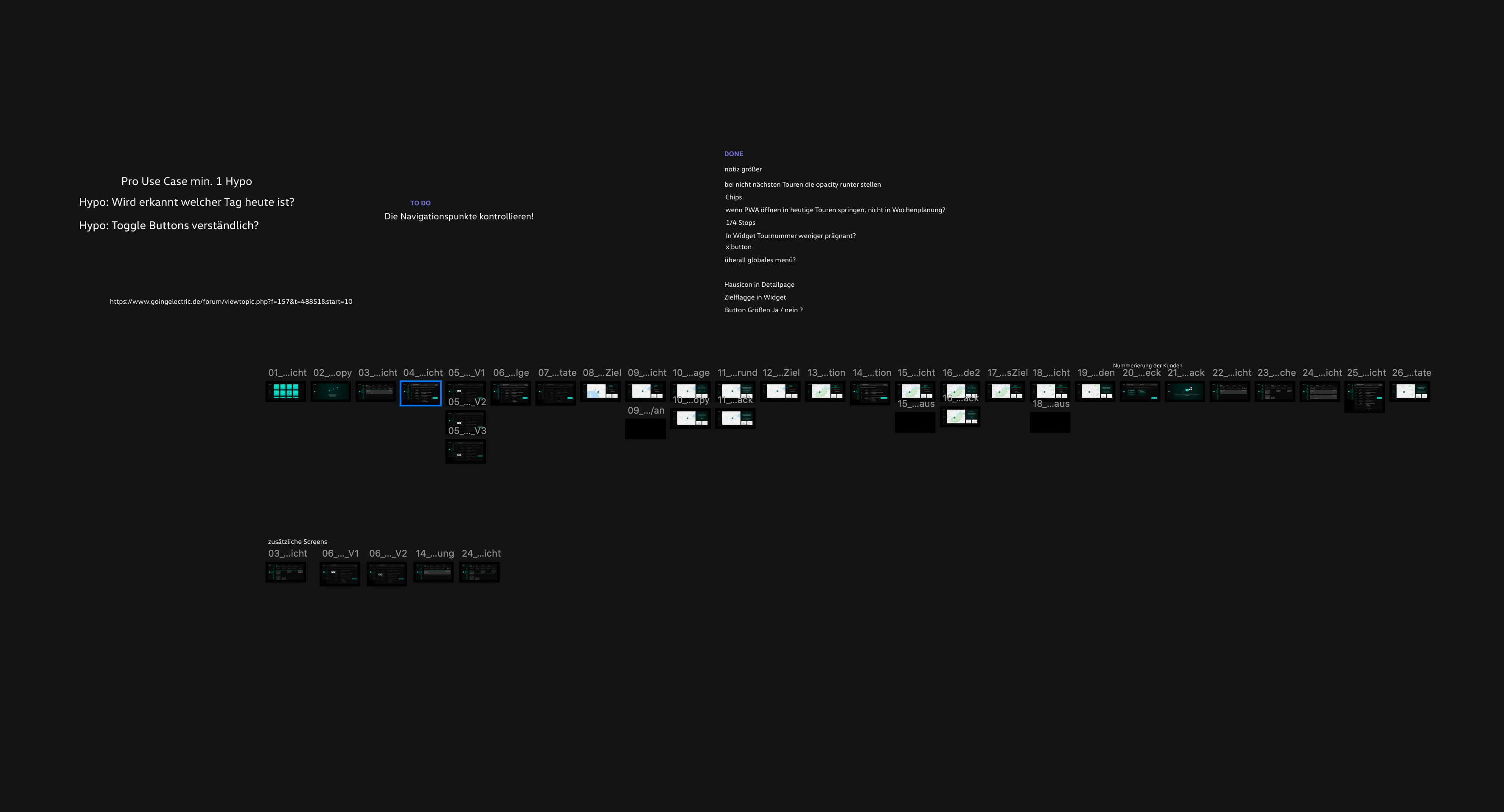
Results
The overall feedback was very positive. The attrakdiff marked the concept as being „desired“ as well as „action-oriented“. I applied my knowledge from the usability test to the evaluation of the seven hypothesis and identified three Pain Points. The following Iteration fixes them and gives an idea for a possible second iteration of the product.


Iteration of Pain Points
Pain Point 1
The notification icon was not perceived by the users
Fix
In order to make the icon visible, I added an indicator bubble with the number of changes that have been made to the tour. Furthermore I thought of the LED stripe within the windshield, that starts flashing when a smartphone, which is connected to the vehicle, is called. This technology does not distract the driver and could be used, to announce a change in the tour. Within the settings menu, the driver can enable or disable this function.
Pain Point 2
The reasons for the display of the notification icon weren't understood intuitively
Fix
Once the driver has interacted with the notification icon, he gets a short notice that tells him what has changed. He can then decide to either click the „View“-Button and enter the detail entry within the PWA or press „back“ to get back to the navigation.


Pain Point 3
The navigation using the X to get back to the home-screen was hard to understand for the user, instead they tried using the arrow.
Fix
This problem is a central piece of the in-car infotainment system across all apps, because of it being a I.D. feature as seen in the I. D. 3. I believe this is something that the driver gets used to, just as he does to the apple or android software.
7. Outcome
Goal achieved? - YES! :)
The concept has the potential of supporting not only the user, but also the business behind him by creating a good experience for the clients. The decrease in distraction leads to an increase in safety for both the driver as well as the clients. Not only the employee experience will be more positive, but the service as well, which leads to happier clients. The disposition organizing tours, driver and clients will have more information at hand, which is also more reliable. This chain of events is very good for a business, that does such an amazing job enabling individuals.
Where can this concept go?
Up to this point the focus was top-to-bottom communication - disposition to driver. In the long run it would be very important to enable the driver to chat or call the disposition. It is also very exciting to think about other interaction concepts such as voice interface. This would help driver to use the service even more intuitively. To make this possible it needs to be 100% safe to not record sensitive data or voices of clients. Making this concept I had to make a choice: Do I want to create a future concept that could involve a VUI, or do I want to create something that has the potential of making a difference in the very present? I chose the last option, partly because everything else would feel like creating a concept based off of hypothesis about the future and didn’t seem right in this context.

„It’s vital to remember that design is exploration, and it is both futile and counterproductive to try to plan everything, whether for a project or a session“
This is Service Design Doing, p. 398
Learnings
Empathy
I grew to have deep compassion, respect and empathy with the driver. They not only drive but also have the immense responsibility of working with people that sometimes have disabilities, which can make them unpredictable and in need for someone who has a warm heart. During my research I also found out, that these driver get minimum wage, which seems to not add up considering how demanding this job is. I am glad to have created a solution that can help them in their daily tasks and could hopefully make a small difference in their lives.
User-centricity is unbelievably important!
I know for sure that I would have taken a wrong turn once or twice if I hadn’t asked questions and constantly tried to talk to companies, users and stakeholders.
Improve in the documentation of UX concepts, research etc.
Research and creating a solution is one thing, but creating material that communicates the insights is another one. Eventhough I am happy how everything turned out, I feel like this is something I can definitely improve in to be more efficient and clear in visual communication.
Research needs to be planned well, because you depend on other peoples time schedules
During the first 10 weeks it was very hard to get companies to commit to an interview. Then I found the business I did the most research at. Their open-mindedness, curiosity and willingness to share makes me deeply grateful - otherwise I couldn’t have worked as user-centered as I did.
Is there such a thing as „enough research“?
I would have loved to talk to more companies from different backgrounds and understand their needs and pains. Apart from getting meetings organized and companies committed, I have to get used to the fact that there will always be facts I won’t get. I cannot know everything - but I can try to get close. :)
Alexa versus requirements
After I did the main part of research I was at a place where the road forks. I could either follow the requirements with no GPS and secure data transfer, or try something out and create a Voice UI concept (which would totally disregard the requirements, because VUI’s are not secure yet). I decided to turn to the first choice, because I want to solve real, present problems. Also I believe that as a designer I have the responsibility to ensure privacy and security. The policy of „only collect the data you truly need“ has its point. For a future concept it would still be interesting to create a VUI - but not with the aspiration that that concept would solve a problem in the NOW.
No Worries
- everything will fall into place :)
Testing on the actual user
The testing I did was „only“ a usability test with individuals, that weren’t in the business of people transportation. This was partly due to the timeframe. I want to know whether the company also thinks, that the service would benefit them or not, so I am still in the process of testing my prototype with the company I mostly worked with.
Mixed Fleet
If this concept would ever become realized, individuals would have to find a way to connect older vehicles to the PWA. The current fleets are mixed in age, brand and model and will stay that way, because each model supports a different Use Case (ex. Sprinter & wheelchair). Also it is not realistic for them to replace the entire fleet with new vehicles. On the other hand the service only creates a real benefit, if the entirety of the fleet is connected, otherwise the disposition would have to work with tow different processes: The present one and my digital concept.

Small recommendation @ the end
I enjoyed working with this method so much. Especially the interdisciplinary aspect is a key strength in my point of view. It not only saves time when everybody is the same room talking about the same problem under a certain time schedule, but also gives everybody a greater chance to gain empathy for colleagues and their expertis
Source of the picure: https://www.shopify.com/partners/blog/design-sprint
Any questions? :) - leave a message
© Inken Alber 2025
UX Research - UX - UI - Design Thinking
Legal Notice | Privacy