Social Design concept created with the ecovillage hannover, 2020
Villageboard
an inclusive project that brings people's needs together
Duration | April - July 2020
My role | UX Lead
Things I learned | Taking responsibility not just for me, but for the team. Also the final deliverable may be important, but other insights generated along the way can also be just as relevant. When it comes to social design - may it be a mindset after all?
Challenges | Being an UX Lead means guiding the way, not showing the way. We all wanted to enjoy this project and learn new things we are intersted in. Therefore I gained sensitivity when it comes to individual needs of teammembers and learned how to adjust accordingly
The most fun | Experiencing this project together with this very motivated and eager to learn team
Credits | Kimberly Löhden, Tiemo Brants, Dennis Klose, Gerd Nord
Context
The ecovillage hannover eg is a housing cooperative planning to build a sustainable village in Hanover, Lower Saxony. In order to suit the needs of its future inhabitants it uses the bottom-up process for everybody to participate in.
Sneak-Peak Teaser
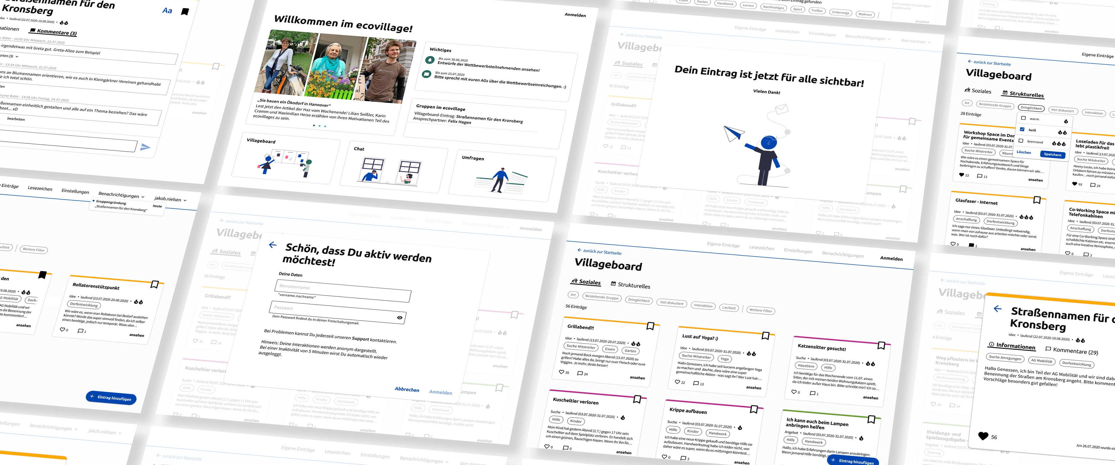
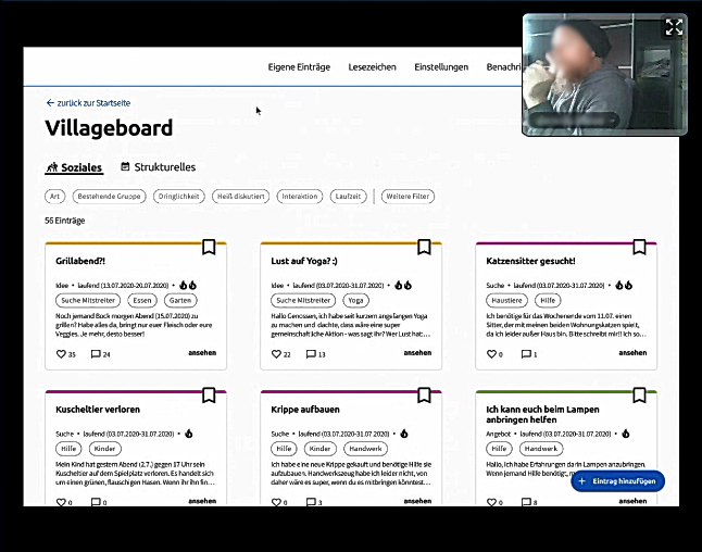
The Villageboard is a digital space, where users can anonymously share and comment on ads to find help or people with likeminded interests.
be aware - the prototype is in german
INITIAL QUESTION
How do people get motivated in order to actively take part in the bottom-up process?
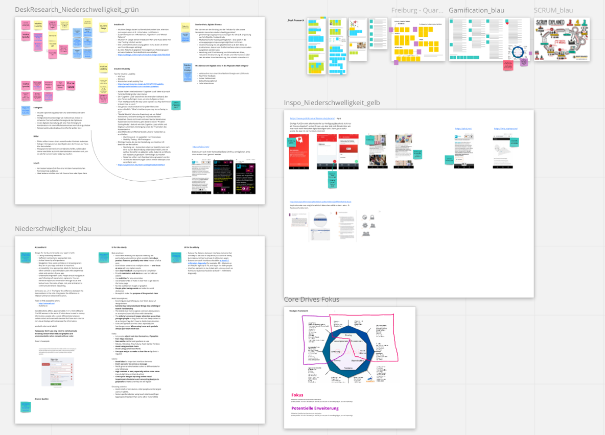
Desk Research
What kind of methods and systems exists in order to increase participation? How do get people get motivated at all?
To answer these questions we started researching about the political system in Taiwan, gamification and many other related topics that crossed our path.
User Research
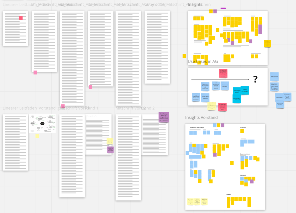
In order to understand current pain points as well as potentials we conducted qualitative user research by talking to the management board and future inhabitants of the ecovillage who already participate in work groups.
We also took part in work group meetings to observe ongoing dynamics.
Due to the global pandemic our work was done 100% remotely.
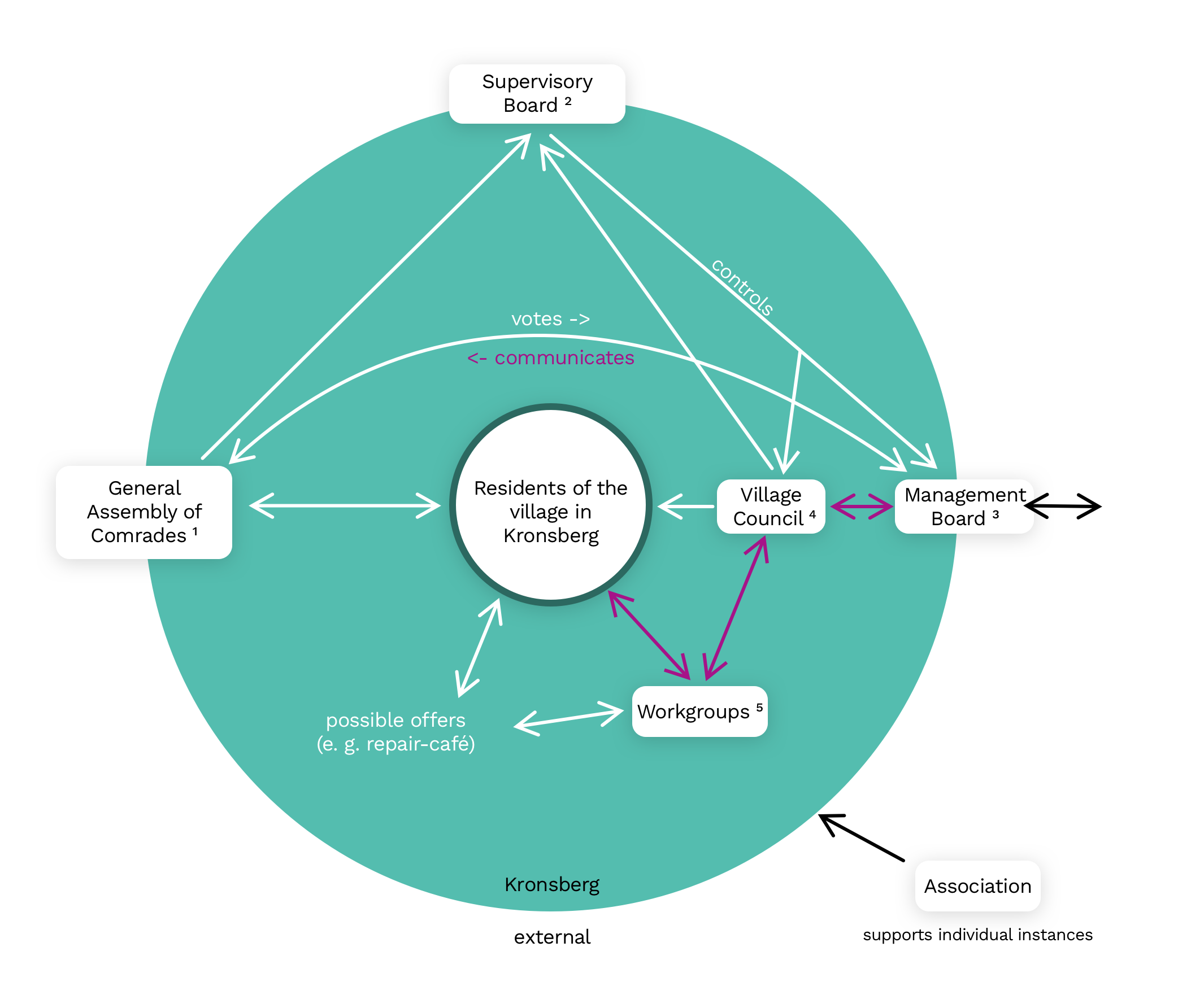
Communication is not transparent
When looking at the purple arrows in the ecosystem map on the right hand side, one attribute of internal communication stands out:
There are several instances between individuals and the management board.
The result is that when individuals communicate their needs and wishes, they get filtered along the way through every instance. Therefore the management board does not "hear the full story". On the other hand, when decisions were made, they get communicated top-down without explaining how the decision was made.
This results in distrust towards the management board as well as individuals somehow feeling overlooked.
7 additional challenges identified
- Motivation
- Personal inhibitions
- Individuals being decelerated
- Individuals not wanting to "bow to rules"
- Responsibilities are not transparently communicated
- Extreme diversity of individuals within
- Service provider vs. voluntary work
Personal highlight of the problem space
We presented our insights to the "Team Change" of the ecovillage. They listened closely and were very grateful for our work. Afterwards they continued to use our research as a basis for their work group.
"You guys are great"
"Everything that was being said.. it makes me think. I believe I heard every single one of these issues come out from somebody in the ecovillage. The fact that you have analysed this so quickly is astonishing."
"You have truly pulled off something very big - thank you so much."
OPENING UP THE SOLUTION SPACE
How might we make the interaction between people across all instances easier as well as generate a system that enhances a maximum of transparency, democracy and collaboration, where each and every individual is being seen and able to contribute?
Ideation-Workshop
We decided to make good use of the ideation phase by researching several brainstorming techniques we were curious to try out. The result was a four-day workshop, consisting of coming up with analogies, anti-problems and doing brainwriting.
After having evaluated our favorite ideas based on impact, feasability and scalability, the winner was the villageboard. We pitched it to Dennis and Gerd, who liked the idea and thought it was a good start to tackle the challenge.
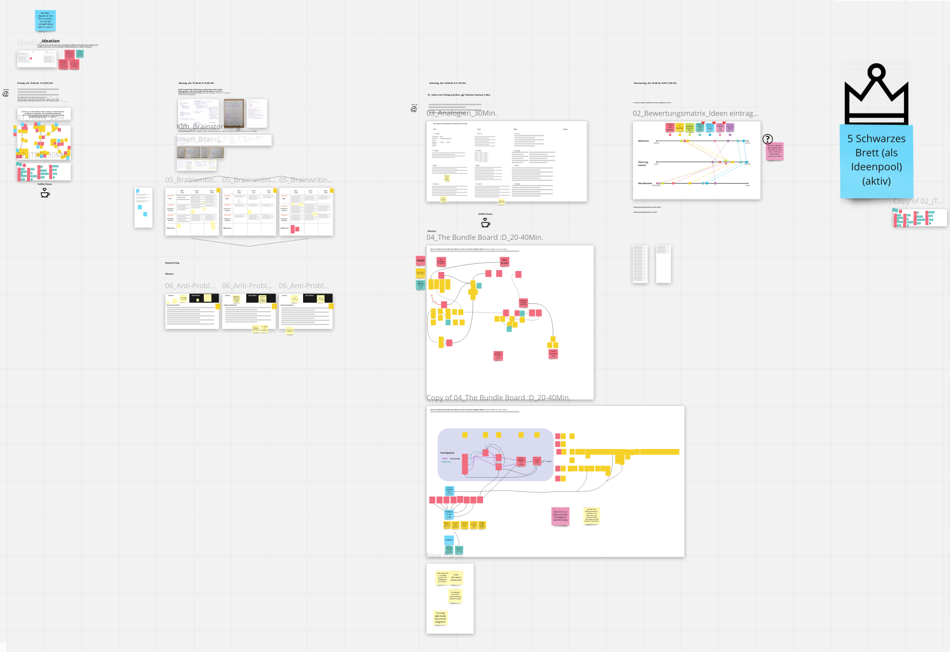
Ideation Workshop
Planning an MVP
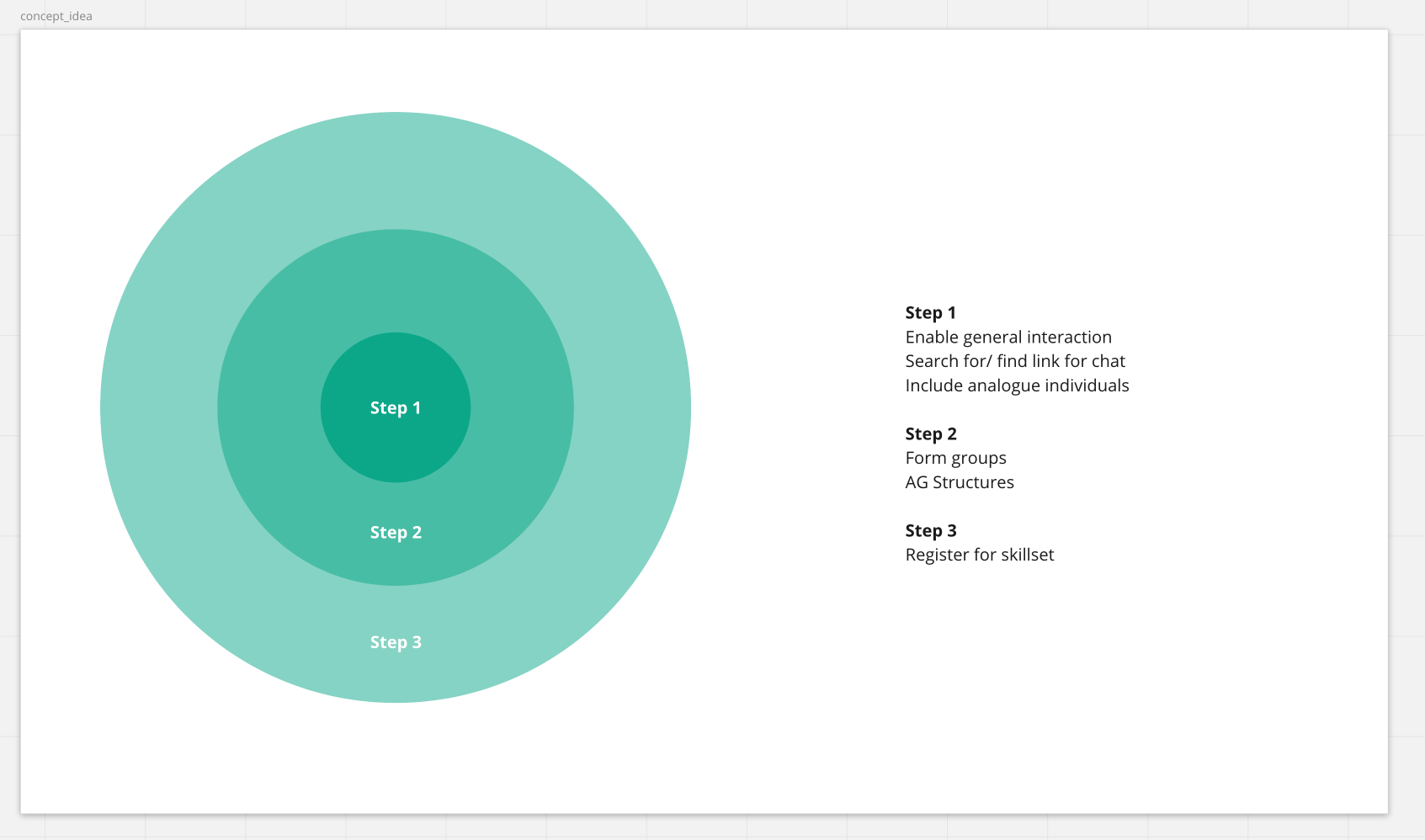
We narrowed the Villageboard down to a couple of features by coming up with a three-step-strategy. This helped us to really focus on the main use cases, whilst being able to scale the concept up when ready.
Creating User Flows
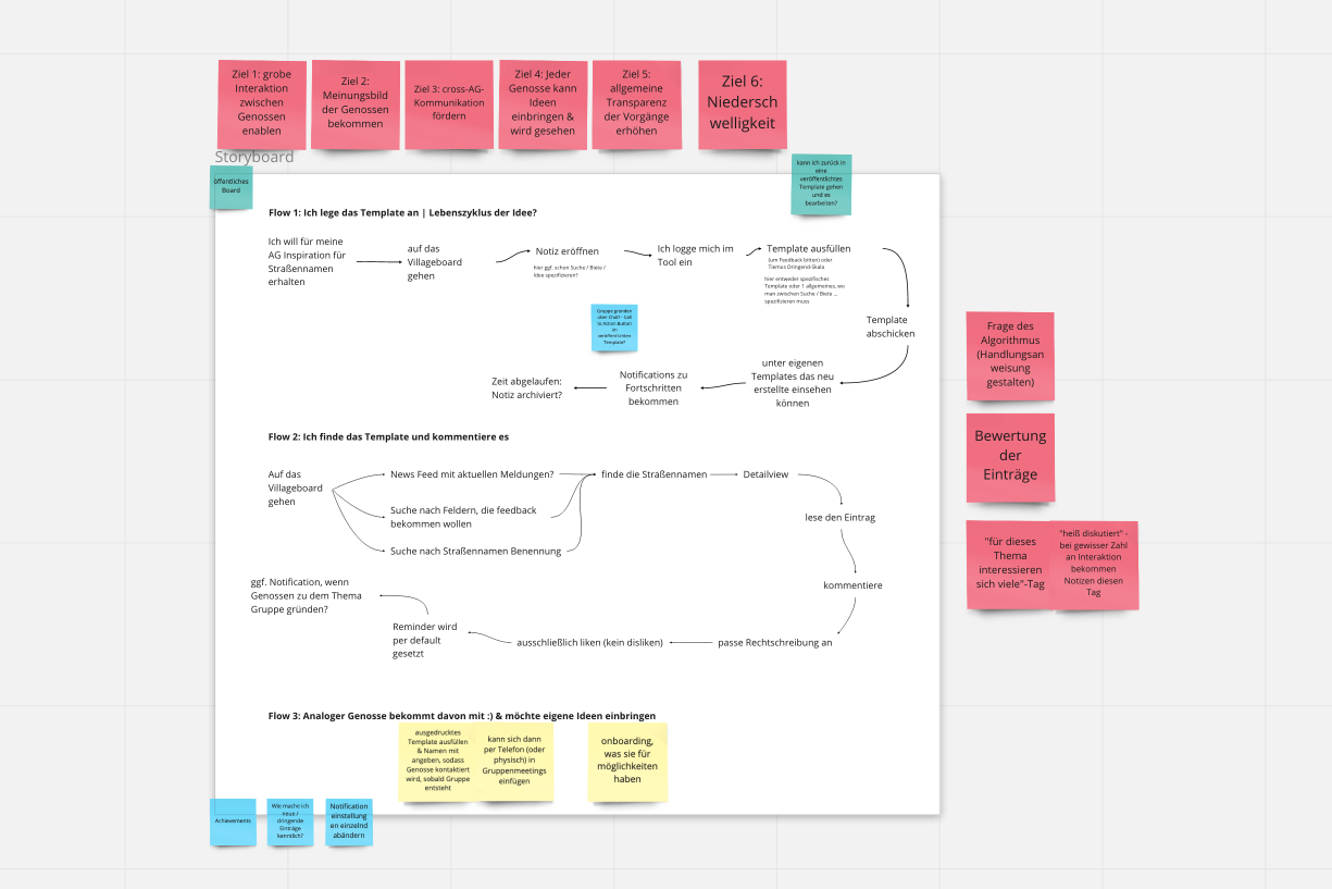
We concepted three flows that would help us focus on basic interactions. The first flow focuses on "The user adds an own idea to the board", whereas the second flow consists of "The user finds an interesting idea and interacts with it by commenting".
The third flow focuses on analogue individuals and what they can do in order to engage.
Tim Brow, CEO and president of IDEO
It's not 'us versus them' or even 'us on behalf of them'. For a design thinker it has to be 'us with them'.
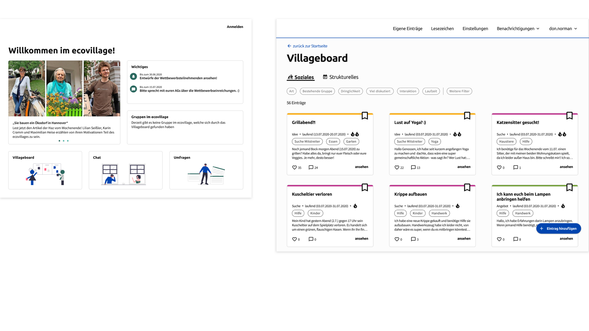
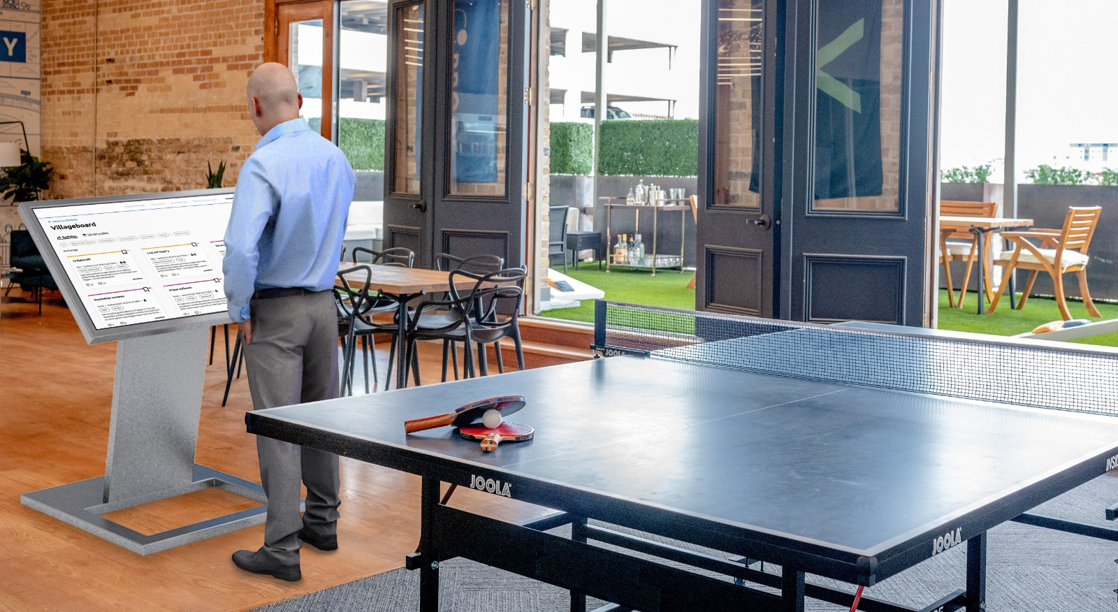
One interface connects you with all digital services within the ecovillage - including the villageboard.
Connect with fellow future inhabitants based on ideas, needs and shared interests.
User Testing
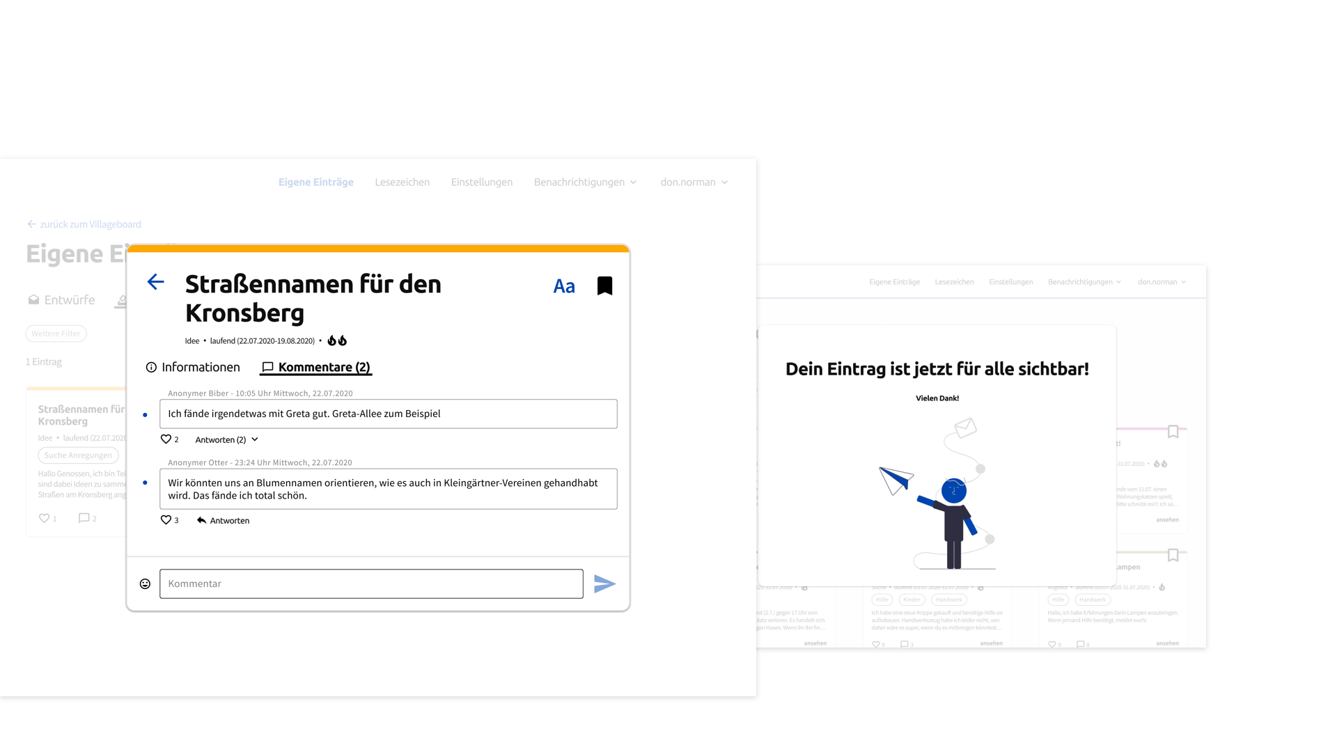
We generated hypothesis, which we validated by testing both flows within the prototype. Our users were future inhabitants of the ecovillage as well as one older individual. We were very curious to check the accessibility and information architecture of the Villageboard. By doing this we identified usability pain points for a possible next iteration, e. g. changing some wordings such as "very hot" for "very important". Also we definitely have to revisit the filter categories, which are also based on a hypothesis of us. They worked in the usability test, but need to be adjusted once the tool is actually being used.
What is so great about the Villageboard?
It is accessible.
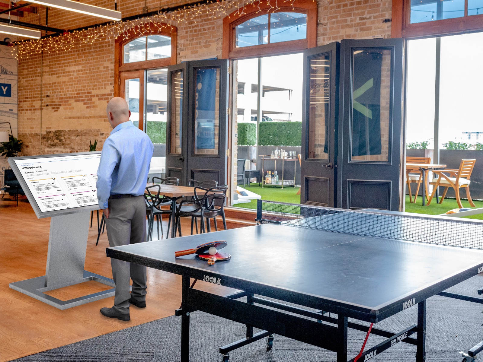
We created a buddy concept that would support the less digitalaffine individual. Furthermore the villageboard uses color contrasts that can be visually differentiated from each other by individuals with color weakness. Last but not least, the digital villageboard comes with a physical board, which gives access to the tool - no need to own a device yourself.
The focus lies on the ideas.
Sympathies and antipathies for individuals are quite natural, but do not belong onto the villageboard - this is why every ad is anonymous. When an idea is being submitted, it should be evaluated by its content, not by whom submitted it. Also: Especially introverts can make good use of this safe space.
This concept needs to be tested though! Maybe using identities is valid after all, but first it is important to trust individuals with their freedom of anonymity.
The content is equally important.
Ideas are equally important until democratically voted otherwise.
Key Learnings
Accessibility needs to be considered right from the beginning
If the goal is to create an accessible tool, it needs to be part of the research scope to find out what that means in the context of the tool. Once that is figured out, insights regarding this should be a constant companion to really make sure concepts are thought through. When it comes to accessibilty testing you have to recruit accordingly.
Discussions are healthy
Our research backed our decision to go with anonymous content. Still, it sparked some discussions about whether people will then feel "too safe" and may even insult others. We think this may be possible, but just because this CAN happen, does not mean it will. Never try, never know.
Think MVP
It can be quite overwhelming to want to bring different feature together into one flow. Therefore I foudn it quite helpful to dial down and really think about what is needed to realize the most important use case. This MVP, minimum viable product, can then be prototyped, tested, iterated and scaled.
Leading means thinking of your team first
In my role as UX lead, I learned how to guide my team without specifying what exactly we need to do. This way, we all influenced the journey of this project and were able to freely try & learn new things. For me that also meant not sticking to tasks I know I like to do, but rather giving them to others, so they also had a chance to experience it.
The Team
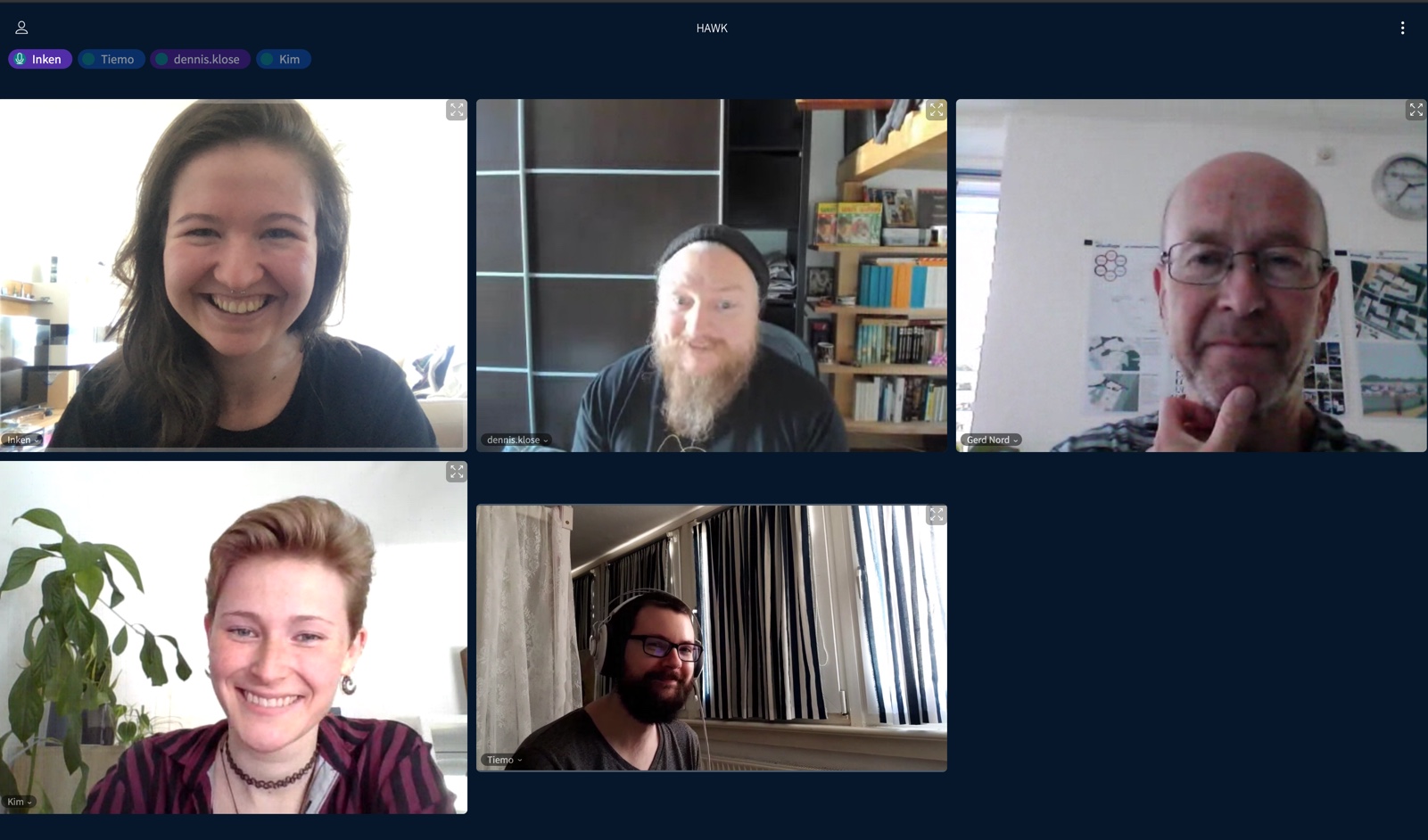
Top left to bottom right: Inken Alber, Dennis Klose, Gerd Nord, Kimberly Löhden, Tiemo Brants
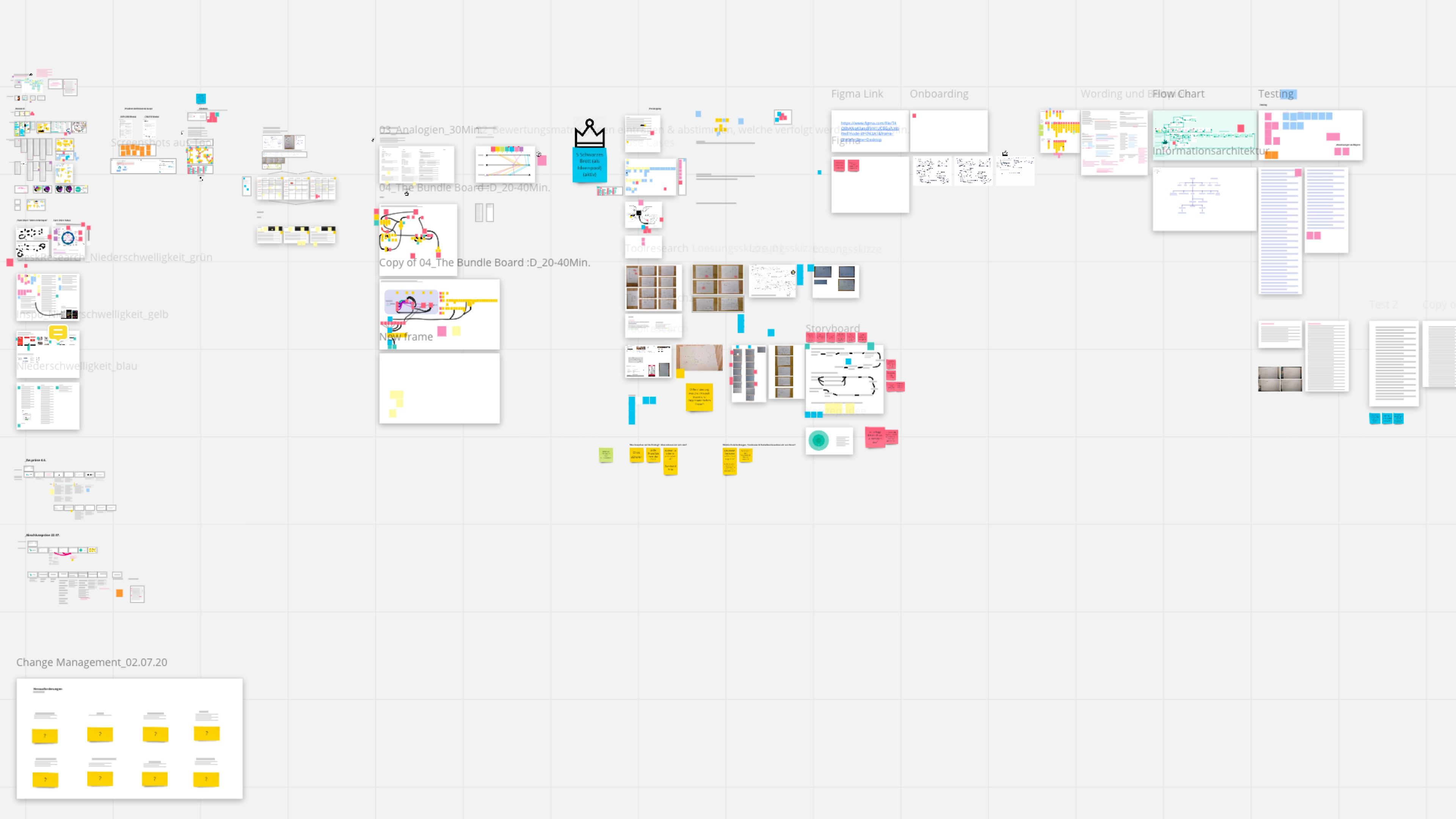
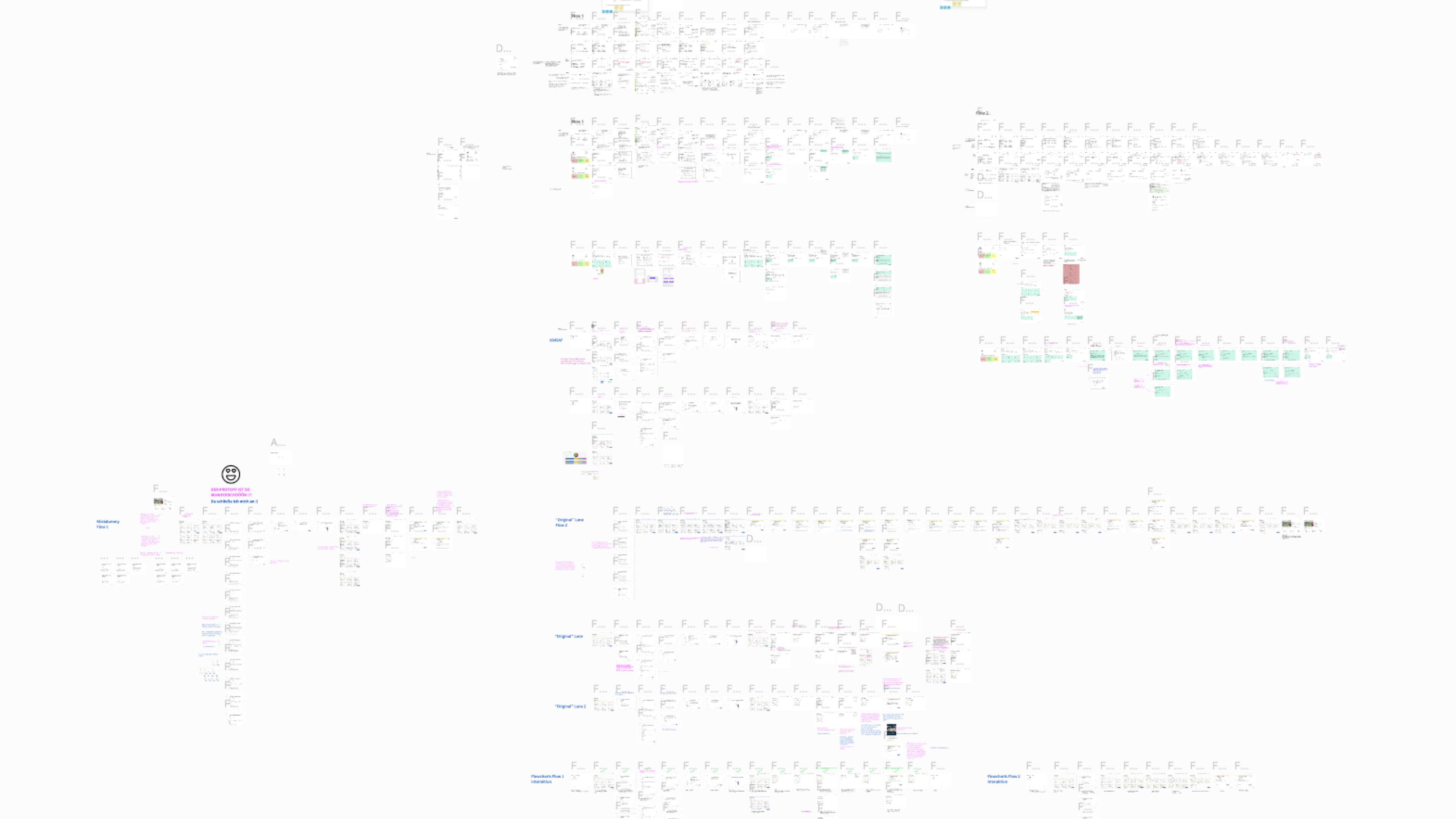
Our work boards on miro & figma
Any questions? :) - leave a message
© Inken Alber 2025
UX Research - UX - UI - Design Thinking
Legal Notice | Privacy

